Database colors and icons: telling your databases apart
Give a database one of twelve colors and one of 110 icons from its menu. Where the color shows — the table-tab strip, not the top bar — and who can set it.
Updated September 2026
With three databases open in three tabs, the question "which one am I in?" should be answered before you read anything. That's what the color is for: the table-tab strip wears it edge to edge, so the orders database is unmistakably not the inventory one. The icon does the same job in lists — the home page, the switcher — where a strip of color would be too loud.
Set them
- Click the database name in the top bar. The database menu opens.
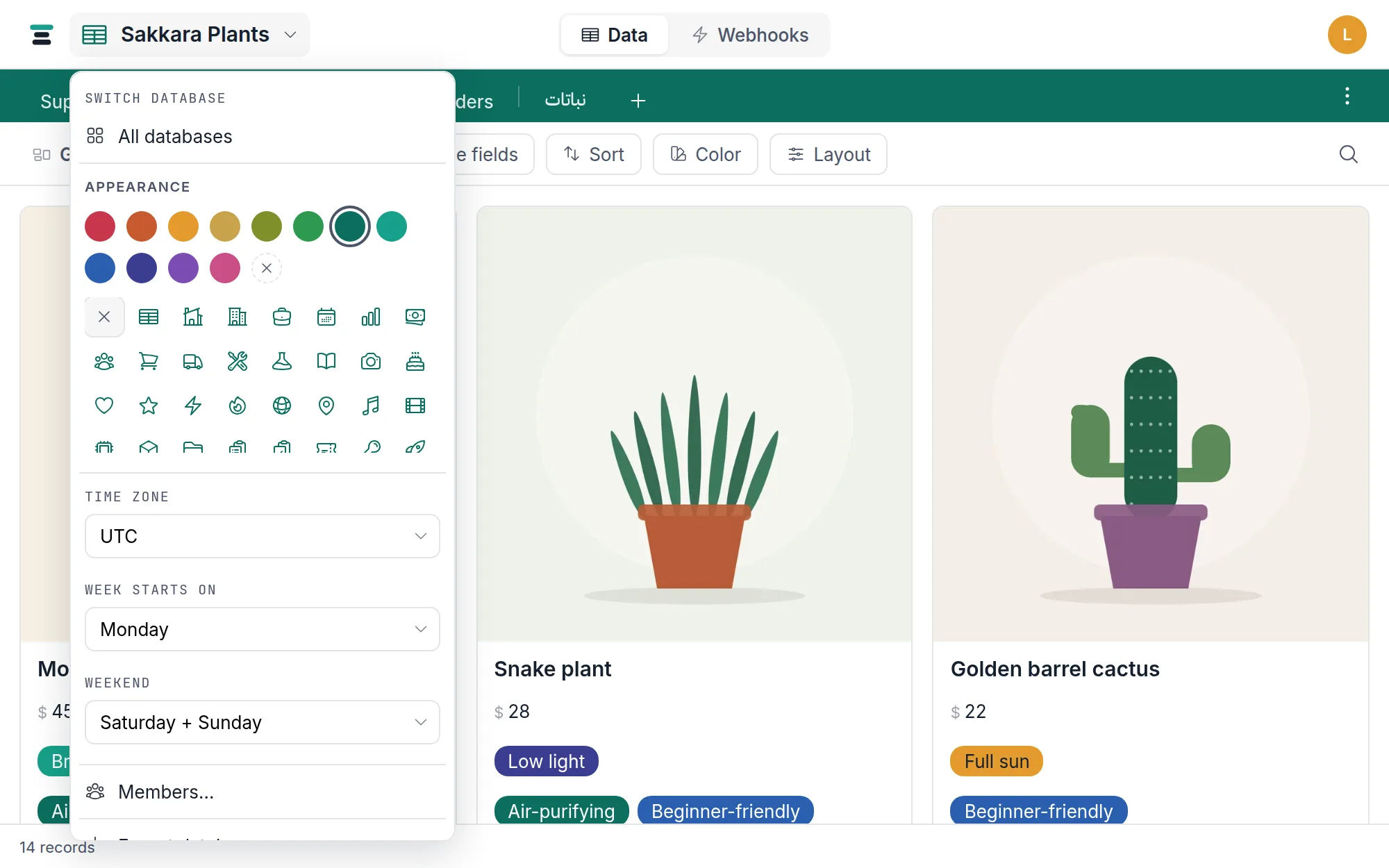
- Under Appearance, click a color dot, an icon, or both. Each pick saves immediately — there is no confirm step.
The dashed circle with the × clears the color; the × tile at the start of the icon grid restores the default table glyph. Color and icon belong to the database, not to you: change them and every member sees the change. Editors and owners can; viewers can't.
The twelve colors
The palette is twelve fixed pigments — pomegranate, henna, saffron, ochre, olive, emerald, verdigris, nile, lapis, indigo, violet, rose (each dot names itself on hover). It's the same twelve you meet everywhere else a color gets picked: select choices, color rules, rating glyphs. One palette, learned once.
There is no custom hex input. Twelve distinguishable colors beat a color wheel for the actual job, which is telling databases apart at a glance.
Where the color shows — and where it doesn't
- The table-tab strip wears the color at full strength. The active tab stays white on top of it, and the inactive tab labels switch between ink and white per pigment, so saffron stays as readable as indigo.
- The top bar stays neutral. Only the small database icon beside the name takes the color as a tint. The bar itself never floods — it's the frame, not the flag.
- The home page tints each database row's icon tile with its color.
- The switcher (the same database menu, under "Switch database") tints each entry's icon.
With no color set, the strip is a neutral sand and the icon wears ink — the state every new database starts in.
The icons
The grid holds 110 icons, general containers first (table, home, office, work, calendar), then domains — money, people, orders, shipping, research, photos, and on through tools, tickets, rockets and wallets. Hover any tile for its name. Pick whatever reads as "that database" to you; the icon carries no behavior.
An icon shows at three sizes: large on the home page rows, small beside the database name in the top bar, and small again in the switcher menu. The default — when none is picked — is the table glyph.
The rest of the menu
Appearance shares the database menu with the other per-database settings: the timezone, the week start and weekend conventions the calendar follows, Share…, Export database… and the rest. One menu, everything a database is.
The questions people ask
Can each member pick their own color? No. The color is a property of the database, shared by everyone in it — that's what makes it work as a landmark.
Does the color travel to public view links? Yes, quietly. A shared view carries a slim stripe of the color across its top and tints its icon tile — enough to say whose page this is without dressing the data.
Why did my inactive tab text turn dark? Contrast. On light pigments (saffron, ochre) white text fails, so the strip switches its text to ink. That's per pigment and automatic.