The gallery: records as cards, led by their images
Records as cards led by a cover image, taken from the first visible attachment field. Card sizes, cover shapes, field labels, and the eight-field cap.
Updated September 2026
Some tables are really about their pictures. A plant catalog, a property list, a lookbook — in the grid their photos are thumbnails in one column; in the gallery each record becomes a card with its image on top and a few fields under it. Same records, same edits, different lead.
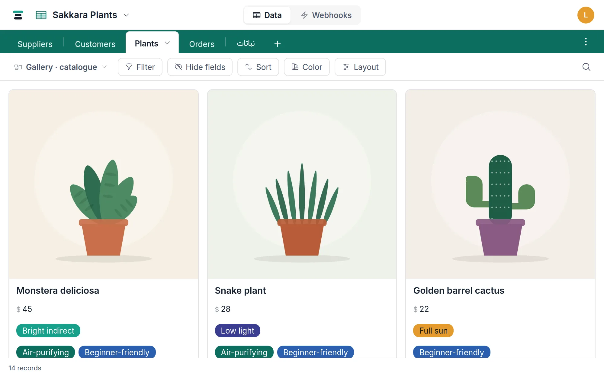
Make one
- Open the view switcher at the left of the view bar and choose Add gallery.
- Cards appear at once. A new gallery starts deliberately spare — the title, the cover, and about three fields — with the rest hidden, ready to be revealed through Hide fields.
- The Layout button holds the card options (below).
Where the cover comes from
The cover is the first attachment field among the view's visible fields — there's no separate picker. Within that field, the first image attachment is used; PDFs and other files are skipped. A record with no image gets a quiet placeholder, so the grid of cards keeps its shape.
Two consequences worth knowing:
- Reorder your fields so the attachment field you want leads, and the cover follows.
- Hide every attachment field and cards have no cover at all — which is a legitimate way to run a text-only gallery.
What a card shows
The card's title is the record's display field. Under it come the view's visible fields, in the view's order, minus the title and the cover field — capped at eight, because a card with twenty rows is a worse grid. Empty fields say nothing: a card only shows what the record has, so cards vary in height and stay readable.
Every value renders the way the grid renders it — select chips, link chips, member pills, checkboxes — and a button field is pressable right on the card.
The Layout button
Three settings, all per-view:
- Card size — Small, Medium, Large. Size decides how many cards fit per row; the type scales with it.
- Cover shape — Portrait, Square, Landscape. Covers crop to fill the shape.
- Show field labels — off by default. On, each value gets its field name in small capitals above it, which helps when two number fields would otherwise be guesswork.
Row height has no meaning here — cards size themselves — so the Layout button stands where the row-height control stands in the grid.
It's a view, so the rest applies
The gallery is a saved view: its filter, sort, hidden fields and color rules are its own. Sort is worth setting deliberately — cards follow it exactly, and "Price, high to low" is a different shop window than "newest first". A color rule washes the whole matching card.
Clicking a card opens the record panel — that's where editing happens in this layout. Search in the view bar narrows the cards the same way it narrows grid rows, and the footer keeps the honest record count. Like the grid, the gallery pages records in from the server as you scroll rather than loading the table whole.
The questions people ask
Can I pick a different attachment field as the cover? Not directly — the first visible attachment field is the rule. Reordering or hiding attachment fields is the control.
Why is my cover blurry or oddly cropped? Covers crop to the chosen shape. Try the shape that matches the photos — Portrait for plants and people, Landscape for rooms and sites.
Can the board's cards show covers too? Yes — the board shares this card, with its own Layout button offering cover, thumbnail, or none.